

Wow, I feel butterflies! I was invited and entered a competition over at Scrapbook Challenges
It was lots of fun to make my layout even though it had to be about me (my least favorite topic for scrapping) and this is the layout I made for it. I say "it". This is just the first round;they're elimination rounds! Everyone can enter this week and then only the top 20 will be in Week 2. The next week only the top 10 and so on for 4 weeks.). Fortunately I have been working on some old family photos and had some of my sister and me from childhood all ready to go! (Had to do some restoration.) There had to be an image of me and journaling about me. You didn't have to photograph your face, just so it was a picture of yourself. Phew!

Anyway... I have two boys, no girls so woweee, I pulled out all the frilly stops! I don't let the fact that I am scrapping for boys keep me from using such things but this was still very different! And fun! Sooo, those pink roses are some I've had forever. They came from the floral department in a craft store once upon a time. I just took them apart, threw away all the hard plastic stuff and reassembled them in a scrapbook friendly fashion with brads and glue dots, then I added lots of ribbon.

Yeah, I went ribbon crazy! Oh my gosh it was so fun! I have been meaning to make rows of scalloped borders and was thinking about doing that, then I pulled out this adorable ribbon (no brand on it, just that it was from Big Lots) and decided to try it with the ribbon. I turned the top row the opposite way but I'm not so sure I like it that way. I'm sure it will grow on me.
On top of the massive amount of green scalloped ribbon I added a matching butterfly. She is painted metal and has been in my stash so long that I don't know who made her. I made a path where she has been flying with purple ribbon from Basic Grey. I used Duck Adhesive (in a roller) to attach the purple ribbon. I love Duck adhesive!

The gorgeous lace was given to me by a friend who got it from her grandmother. I couldn't believe she would give it to me but she had tons of it and had already made a book with it. I added some tea dye distress ink by Tim Holtz to the ends of the ribbon. The pins came from my October Scrapbook Nook kit and are made by Jillibean Soup. The key is a brad. The larger brown outer part of this flower is from some of the packaging from Jillibean. The blue part of it is just where the plastic separated from the chipboard, which I inked with "Twilight" from Close To My Heart. The green scallop (also the negative of it underneath the bottom picture) is punched from packaging by Anna Griffin. I don't really hoard this stuff, haha, I have been getting rid of packaging as I am redoing my scraproom. Wow, what a difference that makes in saving space! But I digress - the paper flowers in the middle are Prima with some tea dye ink around the edges. Outside the chipboard flower I used a stencil by Pebbles and used the same ink to create the dots and just went around the outer edge of the stencil to get the flower shape. It sort of looks like I used a mask, but it was a stencil!

I created the journal box from creme cardstock, which I printed my journaling on first. I printed the words I wanted to hand write in grey so that I would know I had enough space without any fuss. After printing, I used more of the Pebbles stencils and some Tattered Angels glimmer mist in a green shade. I then used my Tim Holtz applicator to cover the rest of the box with tea dye distress ink, just blending it with the green and darkening the edges. I also distressed the edges of the paper and around the punched corners - punch by EK Success. I used a Souffle pen to hand write the words in blue.

You can see the journal box up close in this shot. All ribbon except the ric rac and the green scallops is Basic Grey.
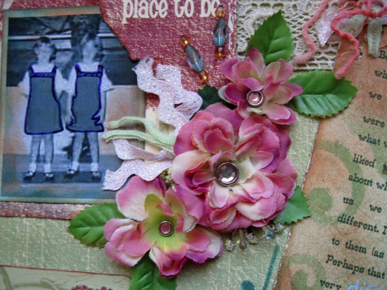
I used a purple Glaze pen to outline our dresses in this photo because it was black&white and I know that we were in a pep rally where I later spent 12 years of school. Not sure how I'm liking that part either, but it's staying.

In case you were wondering, that is me, the kid on the right ;) You all have a valid excuse seeing as I never post pictures of myself haha. The heart bling is Prima, there's the Anna Griffin packaging I mentioned earlier and behind that is a section cut from the opposite side of the background page. The frame for the top photo is also from the reverse of my background paper. I always have to buy the other side! The paper is by Quick Quotes Paper - called "Happy Helen". I am not familiar with them but here is their site: www.shopquickquotes.com
I really loved this set!
I really loved this set!

There is some more stenciling with another of the Pebbles stencils and Twilight ink by CTMH.

I guess I thought you needed a better view of the flower, haha. I love how the ink looks kind of like a shadow.

You can see the background paper a little better at the top. I used some word stamps from CTMH with the Twilight ink in various places on the page.

More ribbon insanity!!

And one more view of the whole thing again :) The two brads in the top left corner spell "Me" and are Zoophabets by Cathy Heck.
Thank you for looking and reading along!


No comments:
Post a Comment